Revisiting: The Life and Death of the Philadelphia Flower Show Miniature Settings

Revisiting: The Life and Death of the Philadelphia Flower Show Miniature Settings

This blog was first published in the spring of 2017.

This is the most difficult post I have ever written on this blog because it involves the deterioration of a miniature exhibition opportunity that I was involved in for years. As many of you know, this blog was started as a way to share  the Miniature Settings exhibit at the Philadelphia Flower Show.  From 2011 to 2015, this blog highlighted not just the exhibits themselves but also shared techniques, provided instructional lessons, celebrated the accomplishments of the exhibitors, created a miniature plant database, and gave examples of other forms of miniatures and miniature artists as a way to inspire exhibitors in the Miniature Settings group at the Flower Show. It also provided documentation of each entry in the exhibit, a documentation that has been abandoned by the current organizers of the Miniature Settings so now you can’t see all the entries unless you go to the show.

As many of you also know, my involvement with the Flower Show ended two years ago when I was supposed to become chair (the person who for the past few years has selected and nurtured the exhibitors) but I resigned because the Flower Show administrators decided to open up the Miniature Setting to anyone, despite a lack of experience in creating miniatures and a miniature garden, who could get their entry postmarked before other applicants. This was not an act of snobbery on my part: it was a way to protest the loss of the most important and most viewed exhibit of miniatures and miniature gardening in the country.

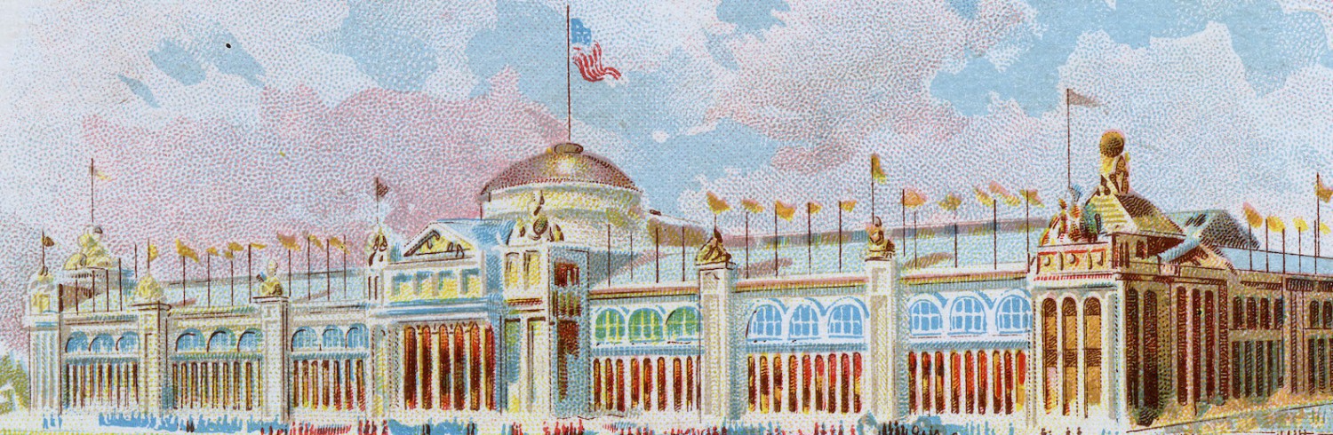
No one has documented the 2016 show and I am not going to document the 2017 show here. What I want to do is explain what has happened to this once premiere exhibit. I will use entries from the current show and contrast them with entries from previous shows. None of these works are mine and I will not identify any of the artists by name.

Is this rude? Maybe, but I think the current track of the Miniature Settings is a great insult to the artists who for at least the past 35 years have created serious, detailed, fascinating, and careful work. I hope the incoming Chair and vice-Chair take their jobs of vetting and, more importantly, nurturing the incoming class of exhibitors. I encourage all serious miniaturists to apply now to the 2018 show even if the first-come-first-served rule is still in effect: they can’t ignore quality miniature work forever. You can apply by calling Flower Show staff and asking for an application at: 215-988-8826. Even if you don’t get in, we need to let them know we will not let this exhibit of miniatures deteriorate further or even disappear altogether.

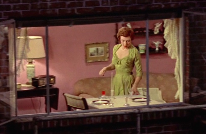
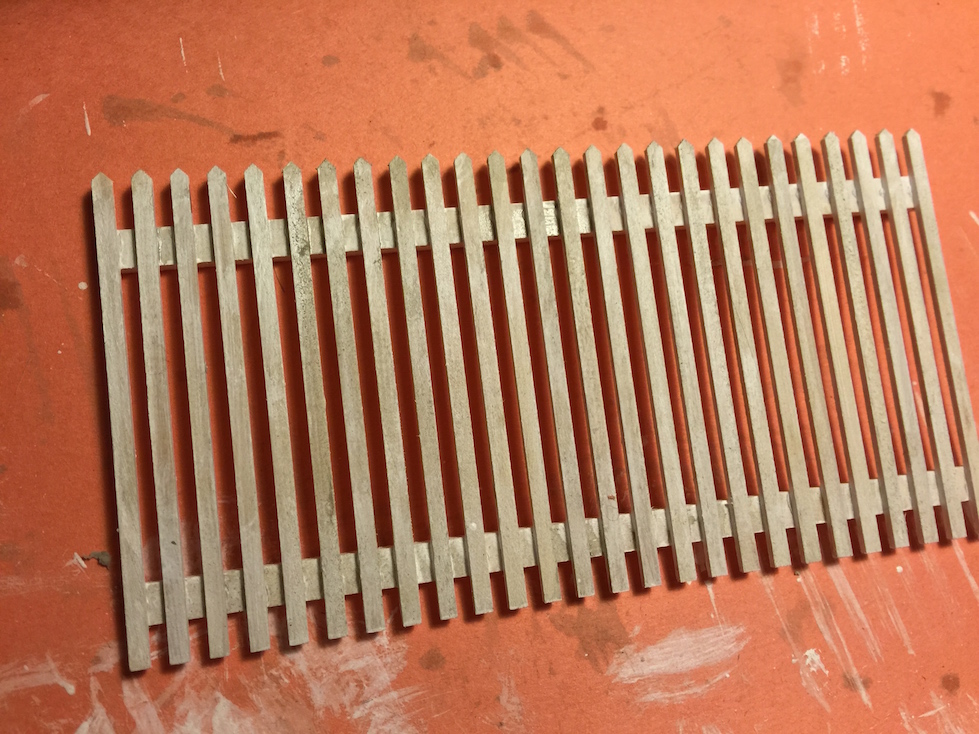
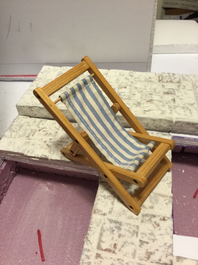
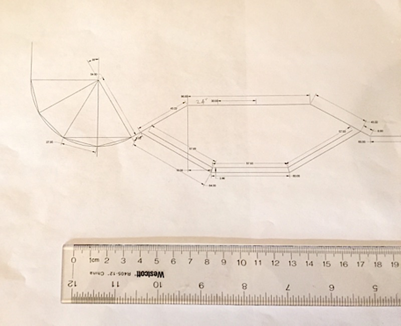
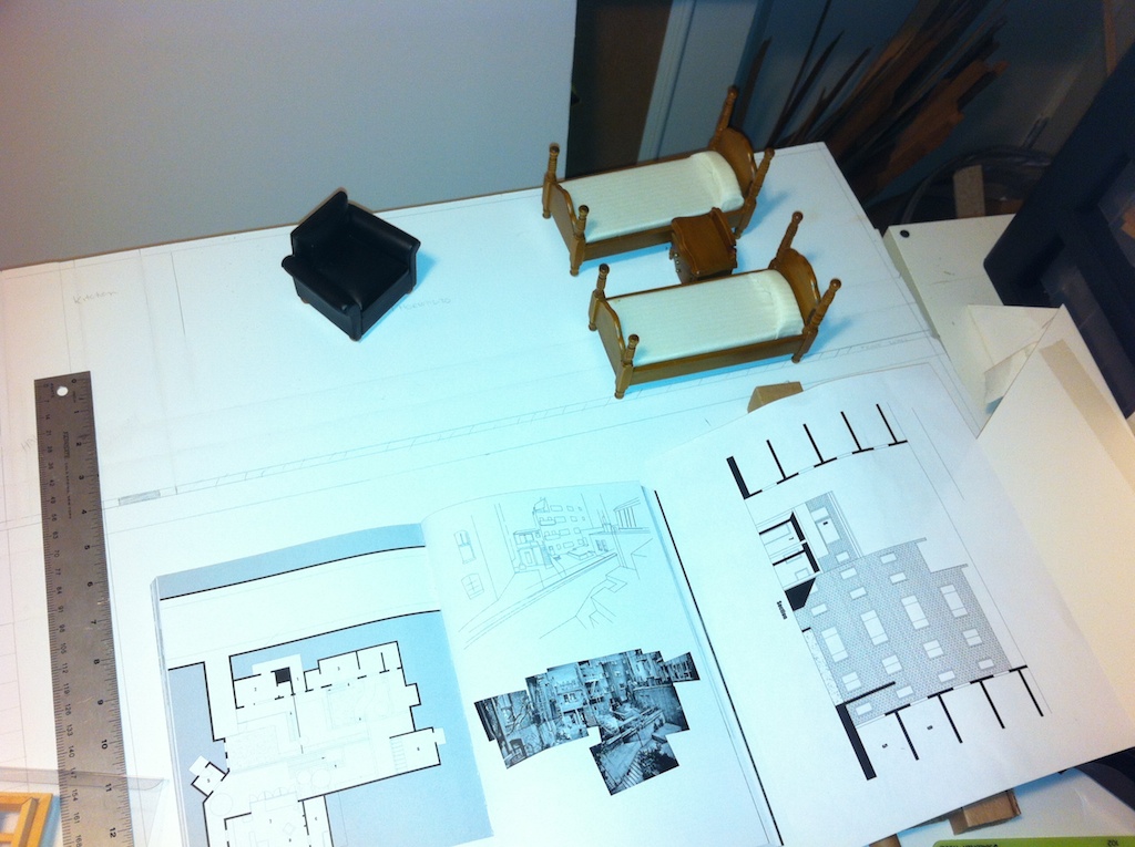
Scale is the most important aspect of creating a coherent and compelling Miniature Setting. This involves scale of the materials as well as all the other components like props and furniture. In the Flower Show, it also involves selecting correctly scaled plants.

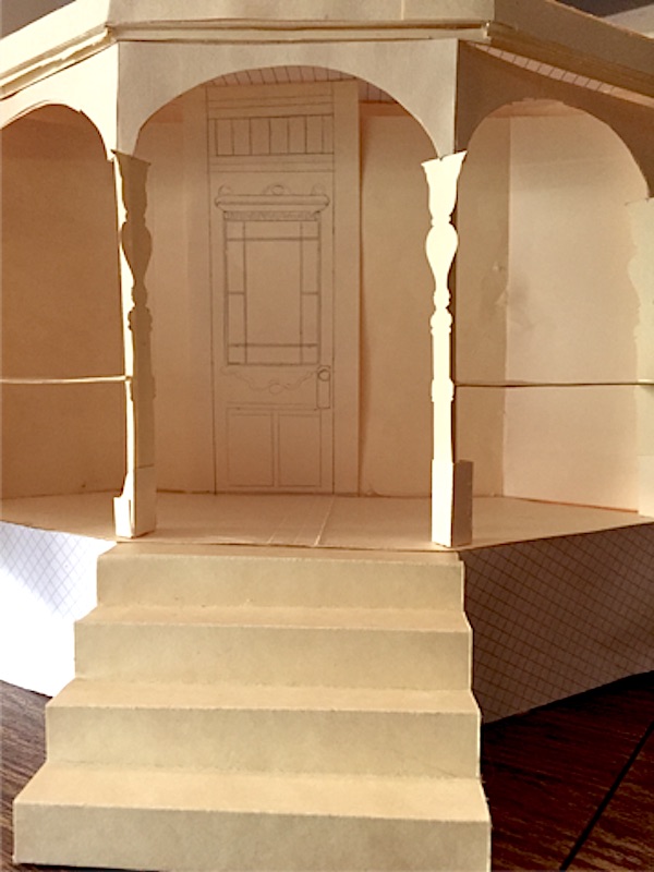
Here is an example of a carefully scaled exhibit with all the elements, including the building materials, properly scaled:

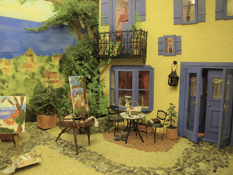
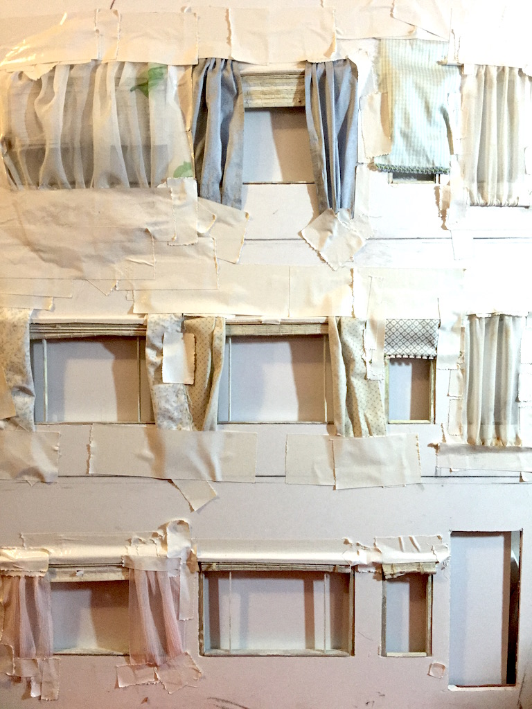
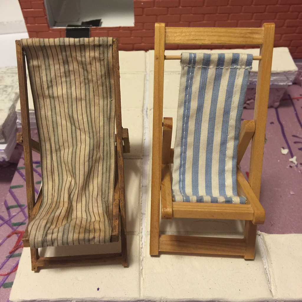
In 2017, most of the exhibits did not utilize a carefully executed scale in plants, accessories, or materials. This is usually a matter of experience and could be easily learned:

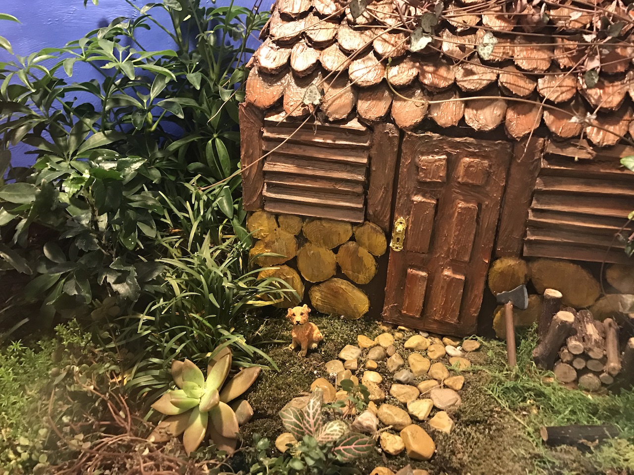
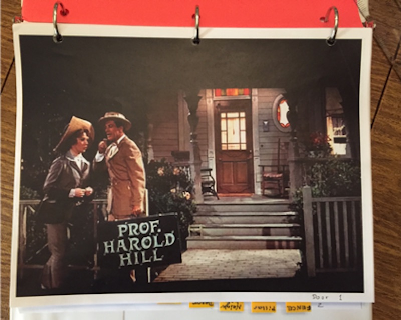
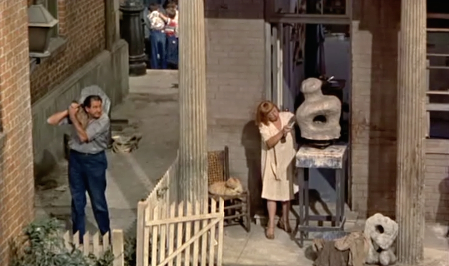
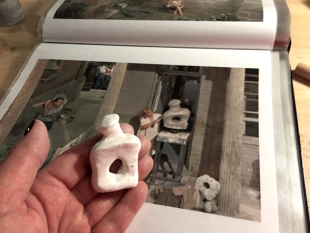
Including figures is always problematic in the Miniature Setting and while some exhibits require the figures, they also need to be scaled and created with care, including their hair and clothing. Here is an example of a perfect use of a figure. All the materials, including the clothing and hair, are perfectly scaled:

In 2017, there were few figures but they were not as careful. Again, this is a matter of looking at what has to be done to a figure to make it either realistic or at least match the aesthetic of the setting:

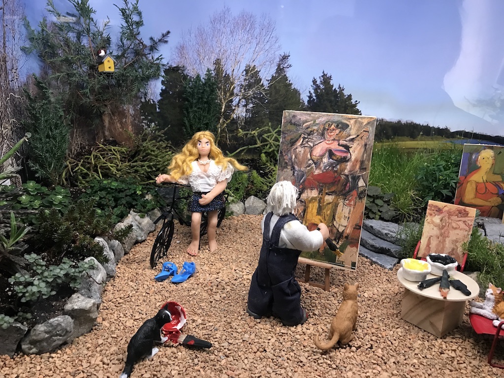
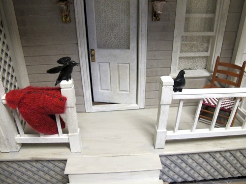
Lighting can make or break an exhibit and uniform harsh lighting can be as problematic as too dark a scene. An otherwise interesting and well-scaled exhibit can be lost to poor lighting. A fine example of good lighting is one that included a variety of lighting techniques:

In an otherwise nicely done 2017 exhibit, the very low lighting takes away from this scene. A balance of indoor lighting with the interesting shelving lighting would have made the interior easier to see (it was even darker than this photo shows):

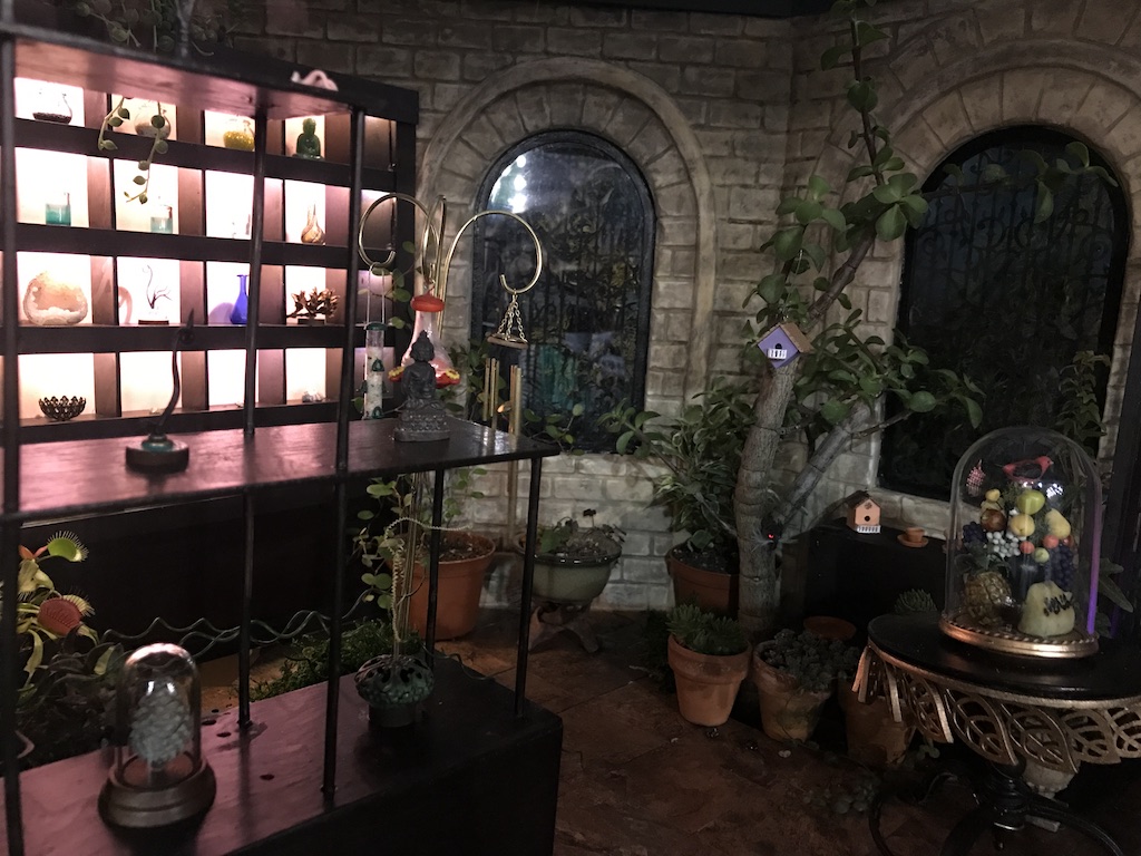
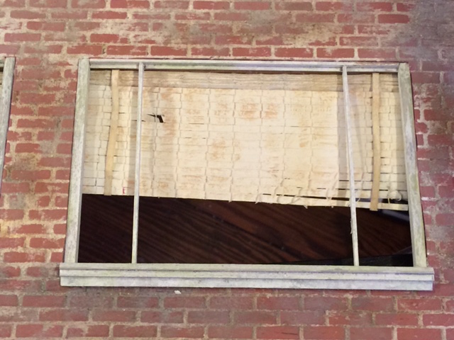
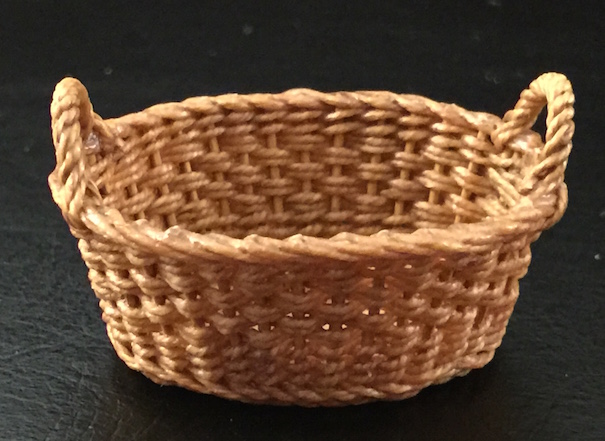
The difficulties of miniature construction are highlighted by both good and less well-executed examples. In a fine example, the edges of buildings and the meeting points of unlike materials do not draw your attention away from the overall scene:

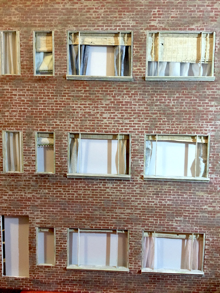
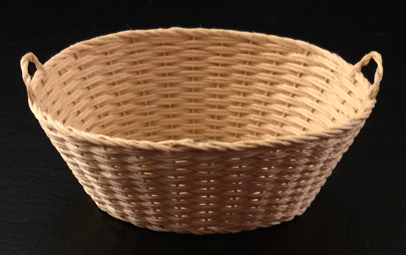
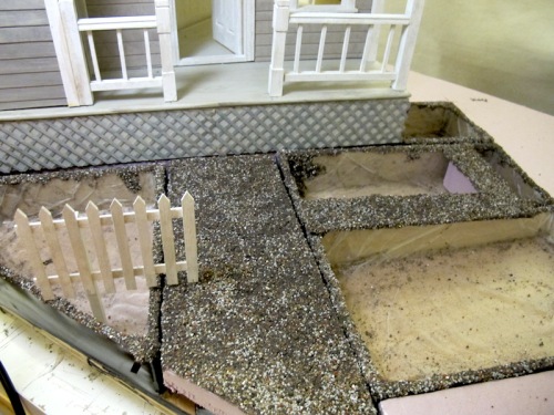
Looking carefully at a 2017 entry reveals unfinished edges and mismatched materials:

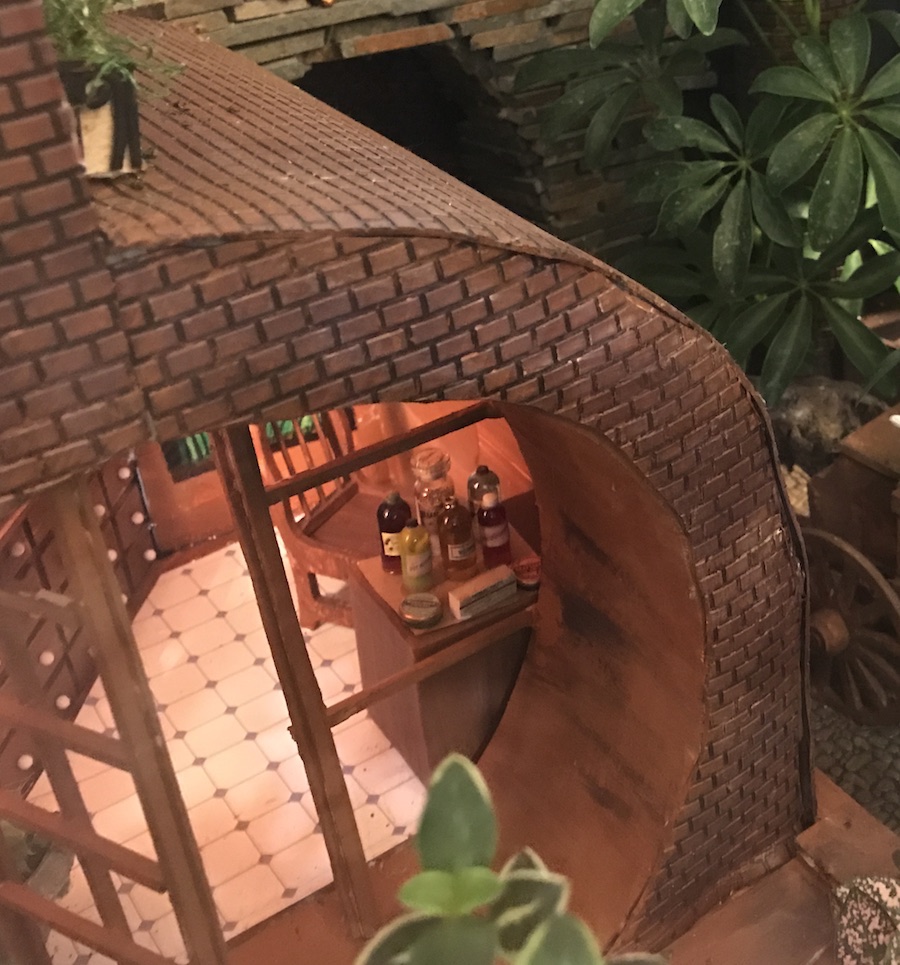
The overall message here is that the Miniature Settings has featured over the years some of the best miniature and miniature gardening work in the country. Now it does not and as a platform for promoting miniatures as a valid and exciting art form, it falls short. The show needs to reinvigorate the model of consulting with its exhibitors during the construction process, providing assistance and encouragement to follow the criteria set out in the judging rules. It also needs to make the entrance into the Miniature Setting competitive, with selection by quality and not by how fast you can run to the post office or get a paper entry into the Flower Show office (how about an online entry form, folks, with a well publicized deadline).

Mini Venetian Blinds

Mini Venetian Blinds

Some things you just have to make yourself. There are no mini venetian blinds (or anything similar) for sale, at least not ones that look good. So here is how I made mine, using something I have been saving for 10 years.

The scene I am doing includes these windows:

Screen Shot 2015-01-09 at 1.19.16 PM

Window blinds at different levels. So, I found this old Chinese calendar in my stash of stuff, saved from my son’s Asian themed birthday party at least 10 years ago:

1calendarIt has slats sewn together, something that would take ages to do. I painted over the text and images and glued the slats to keep them from falling apart once they were cut.

2painted

Looks like venetian blinds from the 1950s to me except the fabric ribbons holding up the blinds need to be white. And I have to unstuck my fingers which are full of superglue!

3blinds

UPDATE:

Actually the problem was weaving the ribbon into the blinds. They look okay when brought to the front. A set of blinds installed:

blindsinstalled

The Patios

The Patios

The aging techniques described in the past few blogs (using a color wash, scratching the surface, adding powdered smudges with eye shadow) can also be applied to patio surfaces. The first patio is made of Paperclay which shrank when it dried and left some nice cracks between the stones I carved into to. I filled these with natural dried moss, The second patio has mortar mix covering the uneven surface of plaster stones and this took the color wash and the powders nicely.

paperclay1 paperclay2 paperclay3patio1 patio0patio2


Miss Lonelyhearts Had a Couch

Miss Lonelyhearts Had a Couch

Another neighbor in Rear Window is called “Miss Lonelyhearts.” She is distraught because she is alone and she drinks heavily to drown her sorrows. She should be distraught from the abuse I give her couch, too. She has a gold couch in her pink living room/dining room. MissLonelyheartsCouch There are few miniatures that you can use without adding some wear and tear and aging. They just look too fake. Here you can see a perfect couch for Miss Lonelyhearts’ apartment but it is too new and neat. So I scratched it up and made wear patterns with a rasp and used Dollar Store eye shadow (which I would never put on my eyes!) to give it a lived-in look. couch1 couch2 couch3

Paint and Aging Techniques

Paint and Aging Techniques

Believe it or not, the urban backyard in Rear Window has a white picket fence around the Sculptress’ garden.

SculptressChair

Here is what a fence looks like after being aged. First layer was white acrylic paint, followed by sponged on light gray. Then a thin wash (black or gray acrylic paints mixed with water). The wash should be very thin, just enough to add some color. Brush it on and then immediately blot it off with a paper towel. Evaluate all the pieces next to each other and make them match.

step1 step2 step4 step5 step6 step7

The Sculptress, Continued

The Sculptress, Continued

This is a continuation of the blog that first introduced the idea of evoking each of the characters in the movie Rear Window rather than trying to directly represent them through figurines or their environments with excessive details (see Part 1).

So the Sculptress has a deck chair that she uses for lounging on her little patch of lawn.

SculptressChair

I had three options for the chair: purchasing one, making one out of wood, or 3D printing one. Here is what happened.

I found this chair in my miniature collection, something I bought well before I planned to do Rear Window.

PurchasedDeckChair

It’s not bad, but like many inexpensive miniatures, the proportions of the components are off: the wood is too thick, the fabric not wide enough.

So I found these wonderful instructions on making a deck chair from the properly scaled wood. Very good step-by-step instructions for those who like to build their own props. Find the downloadable instructions at zooplies.com

deckchairinstructions

Unfortunately, I don’t have the time right now (and probably not the patience) to do that chair so my search continued. While searching online for an alternative, I came across a 3D printable model in Makerbot’s Thingiverse. It was perfect: a great design with hinges that actually worked. I shrank the model down about 5% because the first print was just a bit too big. I printed it in black plastic on my Replicator 2 (the same machine that printed the crows in The Birds last year) then painted it to look like old wood and stained the fabric that I put on. Doesn’t exactly match that in the original but it would take forever to find the match for that. Find the model at: Thingiverse.

The Sculptress has her chair!

3Dprinteddeckchairblack


3Dprintdeckchairpainted

When you see the purchased one and the printed one side-by-side, then you can really see the difference.

2chairscompared

A Guest Post by Hillary Lee

A Guest Post by Hillary Lee

We are delighted to have a future exhibitor in Miniature Settings, Hillary Lee, writing this blog about her experience in trying her hand at designing an exhibit. Her enthusiasm for this project really makes us look forward to her future exhibits. This year she is trying her hand at designing a miniature set for the movie The Music Man. Here is her description of the process and some sketches she used to get started.

Miniatures and plants—what’s not to like!? Miniature Settings has always been my favorite part of the Flower Show. Of course I recognized the craftsmanship that went into the remarkable little scenes as I stared into the viewing windows; I just didn’t fully grasp the amount of craftsmanship involved. As I read through the blogs on what creating a Miniature Setting entailed, it became abundantly clear that there was a learning curve for successful exhibiting. Knowing I’d be an exhibitor in the future, I figured, why not accomplish some of that requisite learning now, go through the process, as if I were exhibiting this February? Nothing like a deadline, but where to start? So I dove in, picked a beloved classic movie (The Music Man), got out graph paper and pencil, and waited for the magical moment the direction of my setting would form in my imagination. It turned into a long wait!
When I first described my idea to Louise, her question was, “Is it iconic?” I realized that I would have to make it iconic with props (a cornet in a music case, the “Piano Lessons Given” sign in the window, etc.). Without any architectural drawings to build from, I had to study “screen shots” of the movie (taken on my I-phone) and make conjectures. After several depressing attempts to replicate the Paroo’s porch (in 1:12 scale), I recruited my husband (an engineer) to make me a CAD plan of the footprint. Very interesting. The set designers took some major architectural liberties with the construction to create suitable backgrounds for the camera shots. Like an Escher drawing, there are impossible aspects of the Paroo house. Oh well, they made it work for their purposes; I will make it work for mine.
I decided to do the mock-up in poster board, and save my gator board for the final construction. Easy as it is to cut a shape out of paper, it only works when you have a correct shape. The columns on the porch were so over-the-top ornate that it probably took me as long to draft the silhouette of one as it took for the lathe operator to carve one! Now comes the challenge. My columns are two dimensional paper cut outs; I need solid columns. Time to seek Ron’s expertise in mold-making. Stay posted for my 3D modeling experience.

MusicMan1 MusicMan2 MusicMan3 MusicMan4


Evoking Memories

Evoking Memories

Any miniaturist who has tried replicating a scene they have seen in person, in a picture, in the movies, or even in their own memories knows it is nearly impossible to include all the elements that scene actually includes. To successfully create a miniature representation of a scene, Ron Hoess (Chair of Miniature Settings at the Philadelphia Flower Show) explains that you have to selectively compress some elements of the scene. In order to fit everything and also to keep the proportions of the elements visually correct you have to remove or reorient some things. Ron does this successfully and impressively with the train layouts he designs and builds. For example, this building had several more columns of windows but once it was compressed to miniature form, it looked too crowded. Removing some of the windows made it look better proportioned even though it does not match the historic building exactly,

RonsBuilding

I call this “evoking” the scene rather than just replicating it. Since we are trying to reproduce scenes from movies for the 2015 Flower Show, I can show how that works with the movie I am working with, Alfred Hitchcock’s Rear Window. As I have complained here several times, the most familiar scene from the movie, the courtyard of some Greenwich Village apartments, is simply too wide and complex to fit in our displays. So I need to evoke the scene without actually showing it all (and possible breaking some of the rules of our exhibits).

Each of the apartments has a character with memorable characteristics and these are what I am going to rely on to evoke a sense of their apartments without actually using figures. For example, there is the couple that sleeps on their fire escape and that have a little doggie that they lower in a basket into the yard below. At Philadelphia Miniature I found the perfect baskets made by an artist who was exhibiting at Jane Graber’s booth (I am not sure Jane made these or someone else since Jane specializes in pottery; if anyone knows, do tell me). Here is a scene from the movie and the baskets I found:

DogCouple-small

smallbasketlargebasket

The dog was a bigger problem because it was hard to find a small dog but also one that appeared to be digging in the garden. Here are the candidates and I will have to add fur to them. Some people have done this quite successfully; I have never tried.

PossibleDogsSo the dog people (called “The Strangers” on film posters and the man and woman on the fire escape in film credits) will be easy to evoke with a few props: the dog, a basket that lowers from their fire escape, a mattress on that fire escape, a cowboy statue on the window ledge (got one from a Monopoly set and another one from a vendor at Miniaturia) and some books and a typewriter..

Another memorable character is the Sculptress (called Miss Hearing Aid in the screen credits). She also has several iconic props that evoke her as well as the building she works in front of which has classic columns that I just received from The Lawbre Company (they are slow to deliver but they make nice architectural details).

Sculptress-small

It’s hard to ignore that rather…symbolic sculpture. Now, I am not a good sculptor but, thankfully, neither is she. I made this effort to duplicate her work in miniature and it is not bad. It needs to be painted and placed on a stand (and psychoanalyzed). UPDATE: I just found out that this sculpture was called “Hunger” and was a studio prop not a replica of a real sculpture.

sculpture1 sculpture2

TO BE CONTINUED…

Looking Carefully

Looking Carefully

Sometimes the miniature accessories we purchase are perfectly scaled at one inch=one foot but they can still look like they are not correct. That is the case with these Houseworks windows I bought. I spent a lot of time painting and aging them but something was wrong. Then our Chair Ron Hoess reminded me that windows in urban structures were set into the walls. The trim around these windows is too wide to do that (these are made for wooden structures like suburban houses). So I cut them down simply by using a sharp blade on the backside. I think they will be more to scale. Look carefully at all your miniature components. Just because they are technically to scale doesn’t mean they will look right.

windowstrimmed

Another example of this is the mailbox I had last year in The Birds. I got the measurements for it from the US Postal Service website so it is the correct size but to the judges it looked too large.

mailboxfinal


SINGAPORE6239 copy

This is The Birds as it appeared in Singapore, with a bird sitting on the mailbox. Perhaps the bird makes it look more in proportion.

How to build a building

How to build a building

The first time I did a Miniature Setting for the Philadelphia Flower Show (2011), I was a substitute for someone who had to drop out at the last minute. I was invited to exhibit on January 1st for a show that opened only 8 weeks later. I didn’t get started for two weeks so basically I had 6 weeks to make it. That is definitely not enough time and over the years I have learned to start really early. I’ve spent months designing this year’s exhibit, trying to figure out how to compress an entire Greenwich Village courtyard (from Rear Window) into our 36inch by 24inch box. The key is to identify the key iconic elements and include those while eliminating the unnecessary parts. I will write a post on that in the future and hopefully all the exhibitors this year will identify the key components of their exhibits.

RearWindowPanorama

In the meantime, I want to show the basic components of my build. It is quite complex, with several building and different garden levels.

This is built in a wooden box 24 inches deep (2 inches more than previous years) and 36 inches wide. It is 37 inches high (the size that will fit in my car).

The first layer is 3/16″ white gatorfoam board. Gatorfoam does not warp and can be cut easily and cleanly, with sharp lines. It is a bit stiffer than foamcore board and quite a bit more expensive. Towards the front of the board you can see a sketch of where the viewing window opening is.

build01

Next I built up the different levels with pink insulation board, available at all hardware or home renovation stores.

build02

When I had the correct height, I added one or more layers of gatorboard because it will have to hold the hardscaping, mostly pathways.

build03After sketching out the layout, each planting area has to be cut out, through the gatorfoam layers (which are glued together) and into the first layer of the pink insulation. These will hold the plastic planting trays which I will demonstrate in a future blog.
build05 build06

It’s important to number the tray areas so they are easier to match up later.

build07

I also used gatorfoam for the building facades. This involved a lot of measuring and design. Some of the windows will be made from scratch and some are purchased.

build14build11 build12

Each building will have a different facade treatment. This one has plastic brick sheets which will be painted and aged later.


build13

More buildings are being added on the sides, giving the entire scene more complexity. The scene is built on a slight angle to the viewing window so it does not appear too static.

build15


More to come.

And so it begins…

And so it begins…

I have started construction planning on Rear Window and immediately panicked. I have plenty of plans that are available in a book on Hitchcock’s architecture and they have given me some nice details that it would have been hard to figure out.

wronghousetitle wallsketch yardplan

BUT…

RearWindowPanorama

The scene is just too big to fit in our allocated space (36 inches wide by 24 inches deep) and the scale we use (1/12th) makes me have to give the rooms 8 inches minimum depth (the width of two twin beds and a night table as in Thorwald’s bedroom:


RearWindowScene159

beginnings

Remember that these are old-fashioned Greenwich Village railroad (or shotgun) apartments that have tiny rooms in a row. When I did a mockup of them, they resembled a doll’s house!!!

RearWindowRoomsAnd they are way too close, unless you were already looking through binoculars at them!

Thorwaldlongview ThorwaldBinocViewHmmm, I could make a mask for the viewing window that simulates the round view of the binoculars or, could have a set of weak binoculars hanging at the window for people to use to get a closer look!

At any rate, Hitchcock made each of the windows in Rear Window look like a mini movie and so I am going to play with that idea. Instead of the apartments merely being photorealistic, I want them to look like mini-movie sets. All of them have minimal furniture and accessories (most of which I have already purchased so I can’t back out now) and memorable actions.

Panic still? Yes, but at least I am not falling out of the Rear Window just yet!

Bird Glue

Bird Glue

I have succeeded in gluing more birds to my hands than I have to Annie’s house or the jungle gym. I tried superglue, plastic cement, wax, hot glue, and tacky glue. Not a lot of luck but finally got these guys to stick. The problem in that there is not a lot of area to use to attach them at their legs. Long evening ahead with fingers stuck together. Superglue it is.

birdsporch

Annie’s Mailbox

Annie’s Mailbox

One of the items I needed for Annie Hayworth’s house in Bodega Bay was her red mailbox.

AnnieMailboxSchool


No luck finding it in any store or online so I had to make it.

mailboxbrass
I formed the body out of a thin sheet of brass and reverse stamped US Mail on the front door.
mailboxreversestamps
The reverse stamp set (hard to find in the right mini size).
mailboxreds
I tested four different reds which may look the same in this picture but were slightly different painted on the brass.
mailboxfinal
The result. I rubber stamped her name and left it faded instead of solid like it is in the movie. Just seemed more realistic that way in miniature.


What Was I Thinking?

What Was I Thinking?

I always get to a point in the production of my exhibits when I just want to chuck the whole thing out and quit. This is that moment. I have made a mess of the front yard of Annie’s house and I have to rip it out and start again. YUCH! What was I thinking???


yuch
Front walk is a mess and needs to be done again…

Birds for The Birds

Birds for The Birds

The Birds requires a lot of miniature birds and I thought about that when I proposed my project. But I thought it would be easy to find and buy the birds I wanted  but that was a big mistake. After searching every online miniature shop, our local miniature store, and several miniature shows, I was only able to get these birds:

purchasedbirds

I’ll be able to use the small ones but they, along with the crow and seagull I need in great quantities, were just too expensive. So it was time to learn a new skill. Last year it was laser cutting which I learned how to do at Nextfab Studio here in Philadelphia. So I took two 3D printing classes at Nextfab but didn’t want to use their machines because it would take me too much time to perfect my models and finally print them and that, too, is expensive. So I bought an inexpensive 3D printer to experiment with and while I did not get any successful bird prints from it, I did learn the not-so-easy art of 3D printing, at home.

On to a better 3D printer, rated by Make magazine as one of the best in its price range: the Makerbot Replicator 2.

3dprinter

It’s not too big and fairly easy to use. I have to tell you that preparing complex models like those for a realistic looking birds is not easy. I have used models made for at least five different 3D modeling programs and have spent hours cleaning them up. I did not want to model my own because I like the detail that I found in the ready-made (and ready for purchase) birds. Once you get a model and pose it the way you want, it has to be processed to be printer ready and exported as an STL file (I am trying to make this a simple explanation but this is not an easy process). Finally the model has to be sent to the software for the 3D printer where it can be rotated (to have it print flat on the bed), sized, and placed on the printing bed. Discouraged yet? Wait till you see what you can do with it once you learn all this!

makerbotreplicator2
The printer works by forcing melted plastic out of a small nozzle and adding layer upon layer of plastic in just the right place.
The result is a bird that can be replicated over and over.
This particular bird took many trials because it wouldn't stick easily to the surface.
This particular bird took many trials because it wouldn’t stick easily to the surface.
bird1
This one printed easily and was easy to replicated.
birdsprinted
I ended up printing three at a time. This model took about 24 minutes to produce three.
crystalbird
When I was first learning the machine, it has a clear plastic rather than the black I used later. I like the crystal bird but it would have required too much painting to get looking realistic.
bird2
I did not purposely make this one with teeth but it definitely looks menacing.
dryingbirds
I coated each printed bird with satin textured Mod Podge to cut down on the glare from the plastic.
shinecutdown
The Mod Podge bird is on the left. I think the patterns made by the printer actually look like feathers.

So, The Birds is coming, and I still have more to print. This has been a long process but now I know how to do 3D printing. Stay young and learn a new skill every year!

P.S. I have no clue how to attach these guys. Can’t get wire into their legs…

How To: A Miniature White Picket Fence

How To: A Miniature White Picket Fence

Annie Hayworth’s house for my scene from The Birds has a classic white picket fence. It is just like the one around the house I grew up in. You can take the fence as a symbol of Annie’s desire for a stable relationship or as a sign of the traditional values of Bodega Bay. Or you can just see it as a fence protecting her house from whatever is outside it. No matter what approach you take, Annie’s house needs that fence.

Annie's fence

AnniesHouse

I thought it would be easy to find that fence in miniature shops or online but, alas, the fences available are really inferior and not realistic at all. Any fence with wire wrapped around it would not do.

wiredwrongproportions

oneinchscalewired

So I had to make my own. Here is how I did it

My first task was to find a real fence and measure it. I found this one at the Chesapeake Bay Maritime Museum in Saint Michaels, Maryland (just happened to be there for a wedding). Nice weathering, good size slats and the correct style of the cut tops.

realfencehigh

I found out later that there are many styles you can use to cut the tops and space the boards:

fencetops

With these images and measurements in mind, I found some balsa wood the correct width (about ¼ inch). I used balsa because it was easy to cut but also because when I whitewashed it (with thinned white paint) the water would raise the grain and make it look like the weathered fence. I cut the tops using a tool called The Chopper (highly recommended although you can easily chop off finger bits if you are not careful). I set up the chopper so that the wood lined up at the correct angle. It comes with guides that do this but they didn’t work the way I needed so I taped some wood guides on.

thechopper
The Chopper with a wooden guide taped on.
cuttingtop
Getting the top angle correct was crucial. Have pieces longer than you need in case you have to chop the top several times.
cut balsa
Cut pieces.

Line up the tops along a straight edge with the crossbar underneath. Use scraps of wood the same width as the slats to space the slats correctly. Glue the slats to the crossbar and keep the spacer wood in place until the slats are dry.

setup
Slats lined up at top and with spacers.

Glue the lower crossbar in place after you trim the wood for the correct height. My first fence was too tall for my scene (even though the measurements in comparison to a real fence were accurate). Sometimes you have to adjust your miniatures so they look right even if they don’t exactly measure correctly.

finishedtootall
Too tall. I had to cut off the bottom and add a new crossbar.
finalfencecut
Correct height and whitewashed. Much better than those wired fences!

The Viewing Window

The Viewing Window

Don’t forget, exhibitors. to view your display through the 12 by 22 inch viewing window (cut one out of cardboard or styrofoam). It makes such a difference to see what will actually show in your display. I just spent hours applying shingles to a roof that is so high up it will not show!

theviewwindow
Remember, 22 inches wide by 12 inches high and people cannot stick their heads in to see the corners so maybe you don’t need to fuss so much with those!
Nancy Grube’s 2014 Project

Nancy Grube’s 2014 Project

Nancy Grube is working on her miniature setting and has this progress report. Her photos show the steps we take to put a project together.

Title:  Wright Beside Them

Intent:  Frank Lloyd Wright was the master of creating architecture that felt like a part of its natural surroundings. We can’t all live in one of his Usonian homes, but this family has been inspired by his designs, and the influence is wearing off onto a young budding architect.

Inspiration image:

Inspiration

My inspiration is the Seth Peterson Cottage on Mirror Lake in Wisconsin. This isn’t an architectural model, but an interpretation of the style which the “owner” of this home used to create their own living space in harmony with nature.

Progress photos:

NancyGrube1

NancyGrube2

NancyGrube3
I hid water reservoirs under the stone floor. I will place the flower pots on top of the openings between the stone and wick water into the pot with a shoelace.

NancyGrube4

NancyGrube5

NancyGrube6

NancyGrube7

NancyGrube8


Tutorials and plans

Tutorials and plans

There are some miniature blogs that provide wonderful links to tutorials of all sorts. One I found is  called “true2scale” and in March they listed 100 different project tutorials. It is amazing how many people there are out there willing to share their expertise in creating miniatures.

Check them out here: 100 Miniature Spring Tutorials

I also found some plans for Mission-style furniture at a site called “Stan’s Plans.” It is actually providing plans for full size furniture but they are easily scaled down to 1:12 scale because all the measurements are in inches.All Free Plans at Stan's Plans

GUEST BLOG: Roofs by Ron Hoess

GUEST BLOG: Roofs by Ron Hoess

All of the structures needed some sort of roof.  There are various products on the market for roofing material from plastic sheets depicting shingles to individual wood shingles.  None of these really were what I wanted. Aside from the iconic thatched roof which I didn’t want to get into,  many of the older buildings in England had either tile or slate roofs.  After reading an article in Dollhouse Miniatures by Rik Pierce on using Paperclay for shingles, I decided to give it a try.  I rolled out my Paperclay using some tools that I got at a Rik Pierce course I took in 2008.  Basically it is a 1 1/2” diameter solid plastic dowel (my rolling pin) and a linoleum tile set in a wooden frame.  The tile is 1/16” below the surface of the frame, so when you have rolled the Paperclay out it will be at a uniform thickness of 1/16”. I should say this is just one of the many things one learns when taking a course with Rik, a teacher par excellence.

roof1

After experimenting I finally settled on cutting out each individual shingle and the then taking a shaping tool and flattening the tile to thinner than a 1/16”.  On the left side of the picture you can see a couple of these tiles, and the tile no longer has the perfect rectangular shape of the cut out piece.  After all the shingles are cut out I take a very stiff bristled brush and repeatedly press it down on each shingle to give it some texture. The shingles are allowed to dry overnight.

roof2

The next day, before I glue them to the gator foam roof, I paint the shingles.  I also paint the gator foam roof black so that any little gaps between shingles won’t show up as white. For the Cotswold cottage, which in real life had a slate roof, I painted the shingles varying shades of charcoal (you can just vary the intensity of the color by diluting the acrylic paint with water).  The pub roof has clay tiles so I first painted all the shingles with terra cotta.   After letting them dry, I came back and painted over them with black and dark burnt umber.  What I wanted in the end is a basically dark roof with a hint of the underlying clay.  After the shingles, or I should say tiles, are painted I glue them to the roof starting with the bottom row and then slightly overlapping each successive row.  Also one needs to stagger the register of each row. Now that a roof is over our heads we can go inside and start working on interiors.

roof3

GUEST BLOG: Structures by Ron Hoess

GUEST BLOG: Structures by Ron Hoess

Now we will start describing structures that are going into the exhibit. Using the initial foam core mock up we constructed in July as a guide, we started assembling the various structures that make up the scene. A fair amount of this was done during the summer so that the last few months before the show is mostly spent in adding details to each structure. We’ll first start with the cathedral wall on the left side of the display. It seems that every English village that we visited had its cathedral. Building a cathedral could easily consume the entire exhibit so all we really wanted to do was suggest its presence without doing the entire structure. The plan was for a wall, presumably the side wall, with a small entrance and one window. We also wanted to attach a partial ruin sort of like a flying buttress off the side with an opening to a church graveyard in the back. For my structures I use Gatorfoam. While it looks like foam core it is much more rigid and does not warp. This is important since I will be applying various materials to the surface, such as joint compound, and I don’t want the underlying structure to warp. I start by cutting the appropriate size piece of Gatorfoam and cut out the window and door openings. Since this is a cathedral one wants to give the stonework a more massive look so I glued on pieces of blue insulation at the base and around the window opening. The surface was then covered with Sheetrock universal joint compound (Home Depot). I do this with a spatula and try and make it a smooth as possible. You will never get it perfectly smooth but that is OK because most stone work is not perfectly smooth either. Let the joint compound dry for at least a day; it should be quite hard by the time you work on it. If there are some serious imperfections just take sandpaper to it and smooth it out, or if there are holes just add some fresh compound and smooth it on. Once the surface is to your liking you can carve your stonework. I usually use an awl. With the stonework carved, the surface can then be painted. I use very inexpensive acrylics such as Dreamcoat to paint these structures. I might start with a light base color of sandstone and then gradually darken individual stones with washes of charcoal or dark burnt umber. You can use washes over the entire surface that help blend the stonework since you don’t want it to look like a checkerboard. You can also use these washes to put some streaks down the building as with rainwater was washing dirt down the sides. At the roof line I crenelated the wall to add a little architectural flourish.

CathedralFront
One thing that I haven’t mentioned is that these Flower Show exhibits are more like theatrical sets than true miniatures. People will only look at these displays through a window so it is certainly not necessary to model and paint things that people would be unable to see. The next picture shows what the cathedral wall looks like from the back. Not pretty but who cares, no one sees it.

CathedralBack